


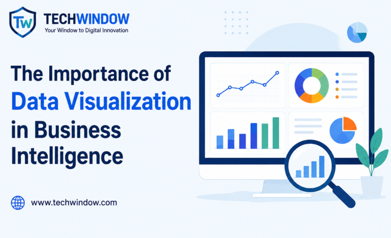
The Importance of Data Visualization in Business Intelligence

In this data-driven era, organisations create a lot of data on a daily basis. A wealth of business data exists, ranging from sales data, customer behavior, website traffic and marketing performance, financial reports, to operational data.
But raw data is of little value unless it is combined with other data. It’s knowing how to leverage data to get insights and then take action. This is where data visualization is a key factor in Business Intelligence (BI).
Data visualization enables organizations to turn complex data sets into easily comprehensible charts, graphs, dashboards, and reports. The visualization of data can help businesses discern trends, make informed decisions, and enhance overall performance.
Tech Window‘s comprehensive guide explores the significance of data visualization in business intelligence, its advantages, essential methods, and the impact it has on business advantage.
What Is Data Visualization?
Data visualization is the process of presenting information through visual formats such as:
- Charts
- Graphs
- Dashboards
- Heat maps
- Infographics
- Scatter plots
- Interactive reports
When users need to understand patterns and relationships in rows of numbers, they can visualize them in a spreadsheet, rather than analyzing the numbers in rows.
The purpose of data visualization is to simplify complex data and make it easier to understand and use.
What Is Business Intelligence?
Business Intelligence (BI) is the technologies, processes and strategies that are implemented to gather, analyze and present business data.
Business Intelligence helps organizations:
- Monitor performance
- Track key metrics
- Improve decision-making
- Identify opportunities
- Reduce operational risks
Modern BI platforms come with a suite of analytics, reporting and visualization capabilities that deliver meaningful insights.
Why Data Visualization Is Important in Business Intelligence
While Business Intelligence provides a great deal of useful information, it is no good if decision makers don’t have it fast.
Data visualization is the process of transforming raw data into actionable knowledge.
Simplifies Complex Data
Many organisations may have thousands or millions of data points to manage.
Users can use visual representations to:
- Understand information faster
- Identify patterns
- Spot anomalies
- Investigate key metrics
The best chart is more effective than a set of reports.
Improves Decision-Making
Good business leaders need to be informed to make good decisions.
With data visualization, executives can:
- Compare performance metrics
- Monitor business growth
- Evaluate trends
- Make data-driven decisions
Quicker insights means quicker and better decisions.
Identifies Trends and Patterns
Visual data makes trends easier to recognize.
For example, sales data displayed in a line chart can quickly reveal:
- Seasonal trends
- Growth patterns
- Performance fluctuations
These patterns can be missed in the spreadsheets without visualization.
Enhances Communication
Visual Data enhances team and department communication.
Teams can present visual dashboards, easily understood by all, rather than explaining complex datasets.
This ensures better cooperation and coordination across the organization.
Increases Productivity
What is displayed graphically saves employees time in analyzing raw data.
Interactive dashboards can help the user to:
- Access real-time insights
- Filter data quickly
- Generate reports efficiently
This is time-saving and boosts productivity.
Key Benefits of Data Visualization in Business Intelligence
Faster Data Analysis
Using visual tools, users can better interpret information than with a traditional report.
This enables organizations to respond quickly to changing situations.
Better Business Performance Monitoring
Dashboards provide a real-time overview of business performance.
Organizations can monitor:
- Revenue
- Customer acquisition
- Marketing campaigns
- Operational efficiency
This helps ensure goals remain on track.
Improved Customer Understanding
Create visualizations of customer behavior and preferences for businesses.
This allows organisations to:
- Personalize experiences
- Improve products
- Increase customer satisfaction
It’s essential to know your customers’ data to succeed in the long term.
Enhanced Risk Management
Organizations can anticipate risks with the use of visual analytics.
Examples include:
- Declining sales
- Unusual financial activity
- Supply chain disruptions
Businesses can take corrective action if they discover the early signs.
Greater Competitive Advantage
Data visualization is a powerful tool for organizations to respond quickly to market changes and customer needs.
This provides a big edge over competition.
Common Types of Data Visualization
Various visualization techniques are used for various purposes.
Bar Charts
Bar charts are best used for comparison of categories.
Examples:
- Product sales
- Department performance
- Market share comparisons
Line Charts
Trends over time can be best seen using a line chart.
Examples:
- Monthly revenue growth
- Website traffic trends
- Customer acquisition rates
Pie Charts
Proportions and percentages are represented in pie charts.
Examples:
- Revenue sources
- Customer segments
- Budget allocations
Scatter Plots
Scatter graphs display the pattern of relationship between two variables.
Examples:
- Advertising expenditure/sales
- The satisfaction of the customer and its retention.
Heat Maps
Heat maps emphasize patterns with colours.
They can be helpful for determining active or inactive areas.
Interactive Dashboards
Many BI tools today feature a dashboard, which can contain several visualizations.
Business insights in real time are captured with dashboards.
Example: Business Intelligence Dashboard
Here are some examples of information a sales dashboard might show:
With such visualization, it is possible for managers to quickly spot the growth trends and performance changes.
Monthly Sales Performance
Example of how business intelligence dashboards visualize sales data.
Industries That Benefit from Data Visualization
Finance
Financial institutions use visualization to monitor:
- Revenue
- Investments
- Risk exposure
- Market performance
Healthcare
Healthcare providers analyze:
- Patient outcomes
- Resource utilization
- Operational efficiency
Retail and E-Commerce
Retail businesses visualize:
- Sales performance
- Customer behavior
- Inventory management
Marketing
Marketing teams track:
- Campaign performance
- Website traffic
- Conversion rates
- Customer engagement
Manufacturing
Manufacturers use dashboards to monitor:
- Production output
- Equipment performance
- Supply chain operations
Popular Business Intelligence and Visualization Tools
There are multiple platforms that enable organizations to build impactful visual reports.
Popular tools include:
- Microsoft Power BI
- Tableau
- Google Looker Studio
- Qlik Sense
- Microsoft Excel
These are the instruments that assist organizations to convert data into significance.
Best Practices for Effective Data Visualization
Keep Visuals Simple
Avoid cluttered charts.
Look at the key details of the information.
Choose the Right Chart Type
There are a variety of charts for various purposes.
Use:
- Bar charts for comparisons
- Line charts for trends
- Pie charts for proportions
Highlight Key Insights
Use visual hierarchy to draw attention to important metrics.
Ensure Data Accuracy
Bad data can result in bad decisions.
Always double check information before visualization.
Use Interactive Dashboards
Interactive dashboards provide users with greater engagement and flexibility.
Future of Data Visualization in Business Intelligence
BI visualization is a field that is changing quickly.
Key trends include:
AI-Powered Analytics
Patterns are automatically discovered by Artificial Intelligence and insights are generated.
Real-Time Dashboards
Real-time data visibility is increasingly in demand by organizations.
Predictive Analytics Visualization
Visual tools will be used to predict future consequences in businesses.
Augmented Analytics
The ability to interpret complex data will be made easy thanks to AI-driven analytics.
Mobile BI
There will be an even higher percentage of professionals accessing dashboards using their smartphones and tablets.
Conclusion
Data visualization is a critical aspect of today’s Business Intelligence. It converts intricate data into easily comprehensible and actionable information, enabling organizations to make informed decisions, enhance performance, and remain competitive.
Visualization can help businesses extract the most value from their data by making it easier to analyze, communicate, and uncover patterns and insights.
We know that effective data visualization strategies will make organizations more successful in today’s data-driven world, and that’s why we believe at Tech Window.